
CASE STUDY:
Lens Logo
How I created the logo for Open Source Kubernetes IDE Lens.
Role: Designer
Tools: Adobe Illustrator
-
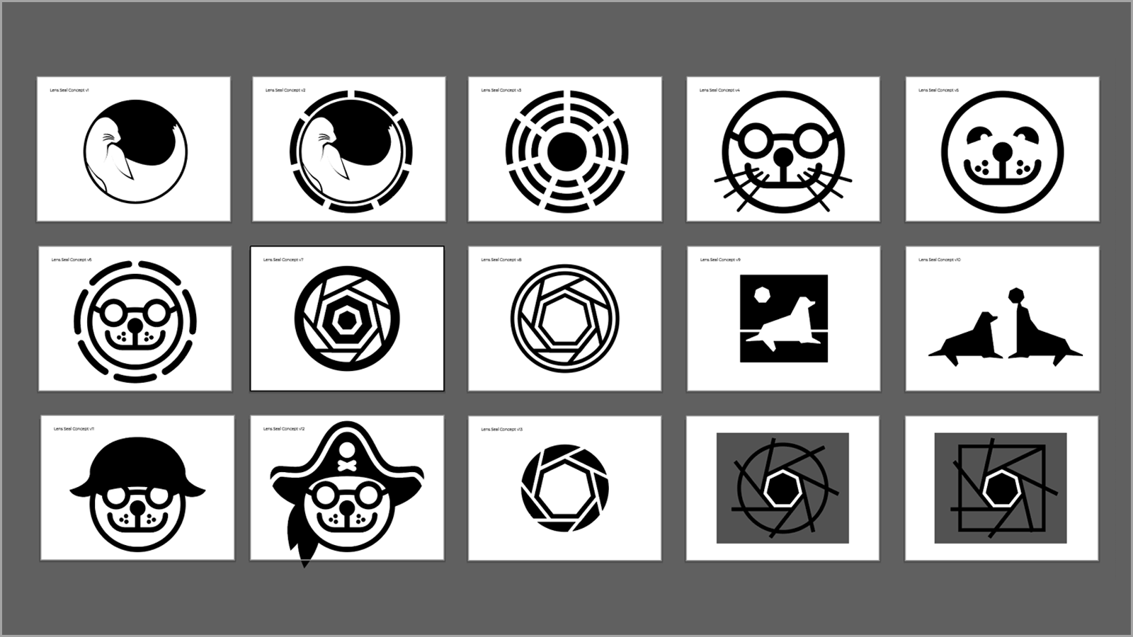
Maybe a seal? Maybe not.
Representing an open source project or a company with an animal had been a trend for a while, so the initial requests I received were to try to create something along those lines. I tried a seal, lots of owls, but it was feeling forced, and the feedback I received from the developers on the project was mostly negative.
-

The seven-sided aperture
The Kubernetes project is represented by a blue, seven-sided heptagon with a ships wheel inside. The heptagon is a fairly unique shape, and we decided to be a bit more on the nose about how we would represent the idea of a lens, this time with a simplified camera lens aperture. The result was an exploration of a seven-sided aperture.
-

Putting it together
The wordmark exploration was relatively short, as we had quickly decided on a simple, sans-serif typeface. I did a handful of iterations until the kerning, spacing and weight felt right, flipped it upside down and backwards and tried it on different background colors. The result was a logo that was well-received by the engineering team and the community.
-

In the wild
The Lens logo was used in a variety of mediums and locations, from the project website at k8slens.dev to stickers, shirts, hoodies, brochures, event booths etc. Its simplicity has made it very agile and functional.